Hotel X Toronto Brand Design
Creating a brand as unique as the hotel
Standing 28 stories high, above historic Exhibition Place, Hotel X is uniquely positioned along the Toronto waterfront, with no nearby competitors and in close proximity to many of the city’s top attractions.
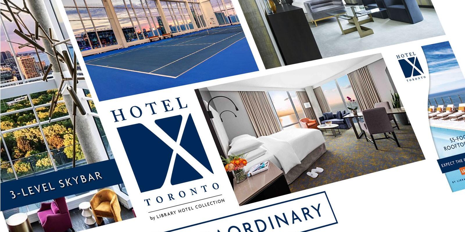
The brand needed to fit the hotels unique positioning and communicate its value proposition, including extraordinary waterfront and city skyline views, an exceptional rooftop patio, exquisite dining, and state of the art fitness and wellness facilities, all just minutes away from downtown Toronto.
It also needed to compliment the existing Library Hotel Collection brands including properties in New York City, Prague and Budapest and be adaptable across applications, from online and print materials to the hotel’s signage.
Through close consultation with the Library Hotel Collection team, it was decided that a simple, contemporary brand was needed which spoke to the hotel’s luxurious atmosphere, and location within the city of Toronto. Like any hidden treasure, X marks the spot, and that’s where the design journey began. The TWG design team took a simple X, adding an elegant custom stylized font giving it weight and dimension. Placed off centre over a dark blue background, the X stands out just as the hotel does on Toronto’s skyline, symbolizing its seclusion from the downtown core of Toronto.
Lorem ipsum dolor sit amet, consectetur adipiscing elit, sed do eiusmod tempor incididunt ut labore et dolore magna aliqua. Ut enim ad minim veniam, quis nostrud exercitation ullamco laboris nisi ut aliquip ex ea commodo consequat. Duis aute irure dolor in reprehenderit in voluptate velit esse cillum dolore eu fugiat nulla pariatur. Excepteur sint occaecat cupidatat non proident, sunt in culpa qui officia deserunt mollit anim id est laborum.


